Odium: To the Core and Monochromatic art style
Hi guys, it is me, the Art guy from Dark-1.
Ever wondered what a monochromatic art style found in games is? Well, look no further as I will try to explain it in basic terms.
First of all, let’s explain what a monochromatic game is nowadays, even though I am not sure if it’s the correct term for games with that specific art style and color scheme. Monochromatic art style can be found in games with a limited or a single colour gradient scale color scheme, meaning you get one colour and all the light and dark versions of that color. It is basically black and white, but instead of white you add red and instead of black you add an extremely dark red.
Here is a photo which best shows how can we find this in nature. Probably the inspiration for this art style.

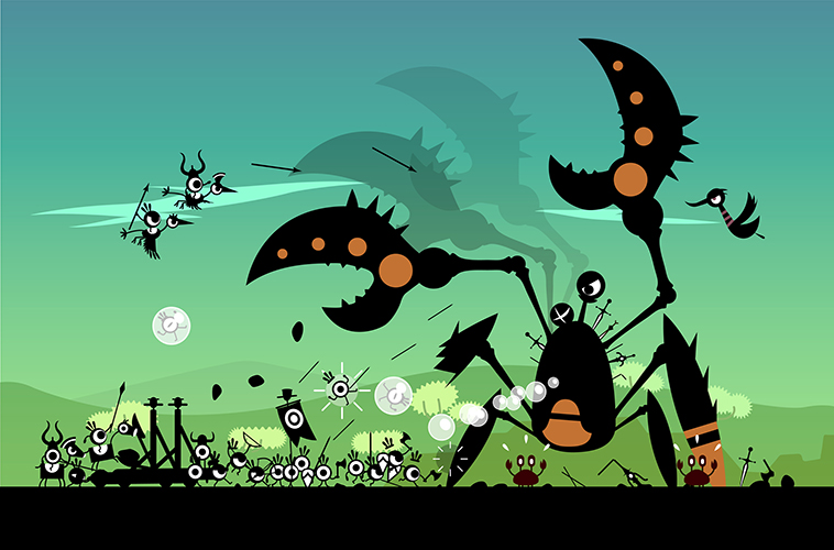
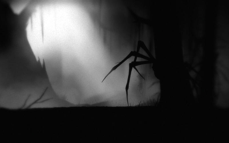
Best examples can be found in 2D platformers such as Limbo, Patapon, Badlands, or Insanely Twisted Shadow Planet, among many others. All these games have one thing in common: clear distinction between foreground and background and communicating form and shape by silhouettes.
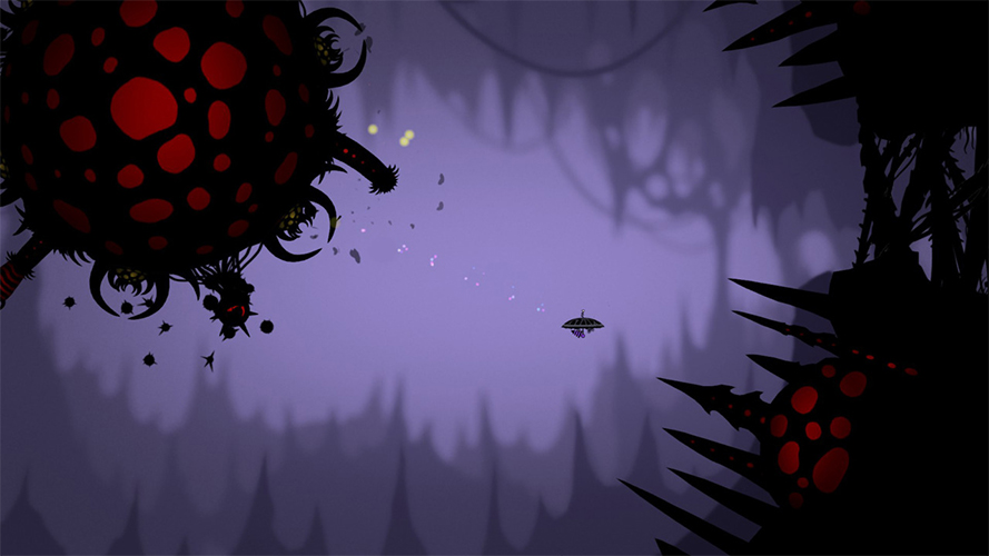
I personally like the cleanness this style offers and how easily can you achieve depth. You can play with an illusionary fog while placing objects in the background.
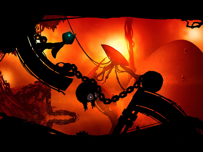
Now, let’s cheat a little and add some additional detail color to that blackness in order to get extra information without oversaturating the scene or visual impact. It will still look clean and you will be able to make out some important or interactive objects even more because of how they contrast against the main color. This is a really friendly art style to work and interact with. That is why we decided to go with it.
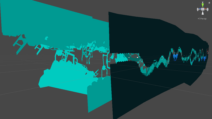
Here you can see how we handle color. Besides the basic three color schemes we additionally add an overlay texture, just to add a subtle color variation and then add more depth by using the depth of field post-processing effect on the camera. Now we have a very clear distinction of what is playable level and what is background.
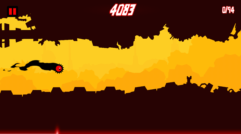
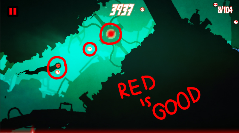
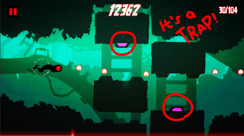
Then we continued with deciding on how to color interactive and dangerous objects. In Odium: To the core, everything that is part of the level is deadly, as reflected through the use of the darkest color. Additionally, we marked red as an interactive color which is a bit unorthodox but at the same time it is our main character’s color so we decided to stick with it. All the moving dangerous parts are marked with a bright magenta color, which we use as the big baddies’ main color and as a way to show how the corruption spreads in the world of Odium.
In conclusion, the monochromatic art style in games is easy and fun to use. But don’t forget, even though it is easy to set up, keep a tight leash and don’t lose control over your colors.